Exploring Results
Below the query panels, five tabs give different views of the current result. Every tab respects your Column Display selection.
Summary and Counts scan the full query result, ignoring the 500-row display limit. Table View, Statistics, and Visualizations use only the rows loaded in the table.
Table View
Shows up to 500 rows of the current result, along with the SQL that produced them. Cells are truncated to 40 characters; hover over a cell or copy it to see the full text. See Usage for a screenshot.
Summary
A quick profile of every selected column.
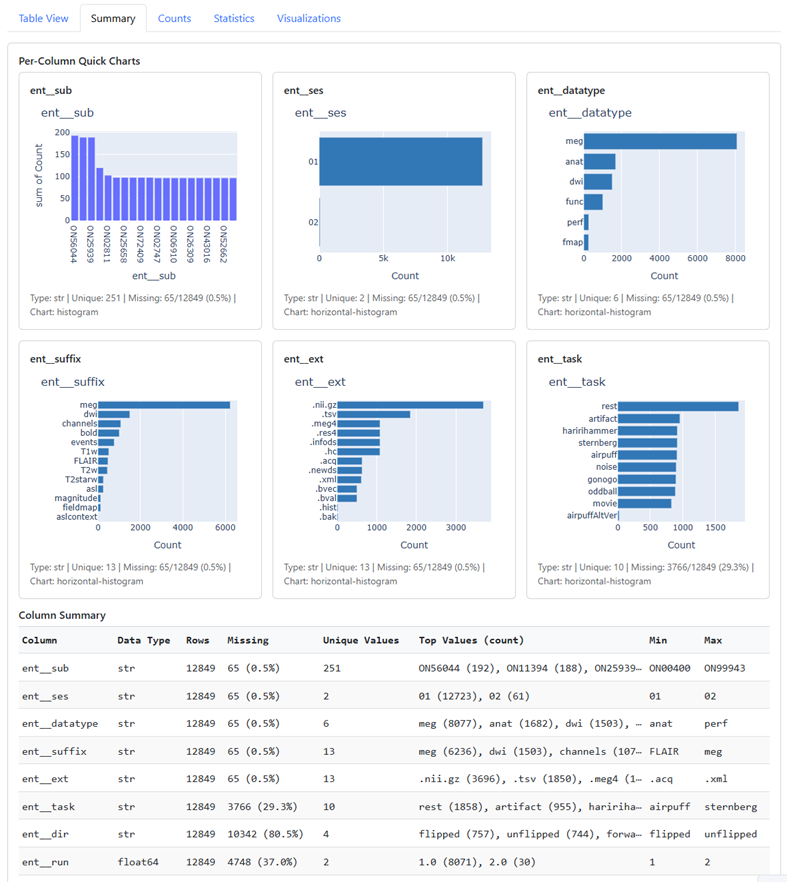
- Per-Column Quick Charts draws one card per column. Columns with 2–15 unique values get a horizontal bar chart, columns with more get a histogram, and columns with a single value show that value. Each card lists the data type, unique count, and missing count.
- Column Summary tabulates data type, row count, missingness, unique values, top values, and min/max for each column.
Empty strings and NA, N/A, nan, None, or null are counted as missing.
Counts
Shows how categories are distributed across columns that have more than one unique non-missing value.
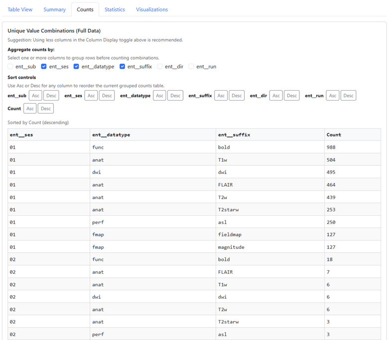
Unique Value Combinations counts the rows for each combination of values. Check columns under Aggregate counts by to choose the grouping, and use the Asc/Desc buttons to sort by any column. With many columns selected this table gets large, so narrowing Column Display first helps.
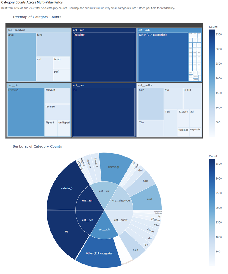
Category Counts Across Multi-Value Fields shows each column’s categories as a treemap and a sunburst. Missing values appear as (Missing), and very small categories are rolled up into Other.
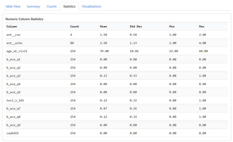
Statistics
Count of non-missing values, mean, standard deviation, min, and max for each numeric column.
Visualizations
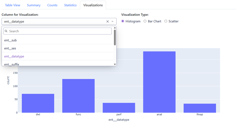
Choose a column and a chart type to plot it:
- Histogram: distribution of values
- Bar Chart: the 20 most frequent values
- Scatter: each value plotted against its row number